
Not Everything is Black and White!
So, I’m a monochrome photographer?
“Colour or black & white?” That was the question one had to consider when asking for a roll of film in your local camera shop back in the day! If black and white was your thing, then what you really needed to ask the shop assistant was “Can I have a roll of black, white and grey film please?” Actually, what I really wanted to ask for was a roll of monochrome film!
The word monochrome will pop up a lot on my website, and as it is commonly used to describe black and white images, I guess I should explain what monochrome is and why my work isn’t actually monochrome at all!
Traditionally, we refer to a photo as being black & white when it’s not in full colour. When we think of black and white photography, we may imagine dark, gritty and dramatic images. Perhaps the work of Don McCullin comes to mind. But even his work is not truly black and white, his prints have a full range of tones.
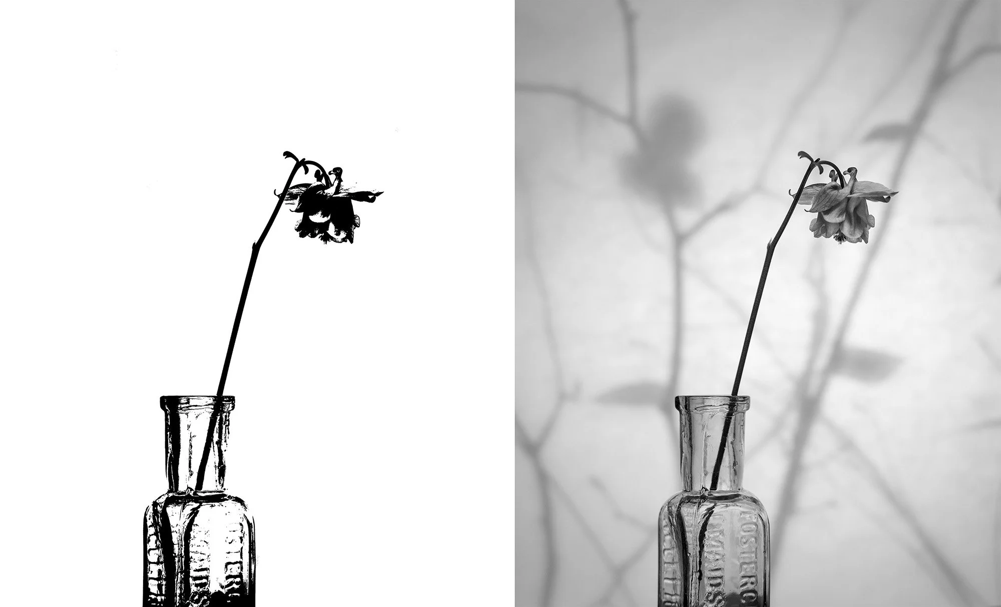
Aquilegia, Shadow Screen. On the left is a true black and white image! On the right is a greyscale image with a full range of grey tones.
A true black and white photo would consist of just that, black and white and nothing else! What we usually call a black & white photo will also have a full range of grey tones and should be referred to as a greyscale image or more traditionally, but not necessarily correctly, a monochrome image. If you were to replace all the grey tones and add a single hue to your image, let’s say blue, then that would be a monochrome image. Instead of greys we now have blues i.e. a single (mono) colour (chrome) image.
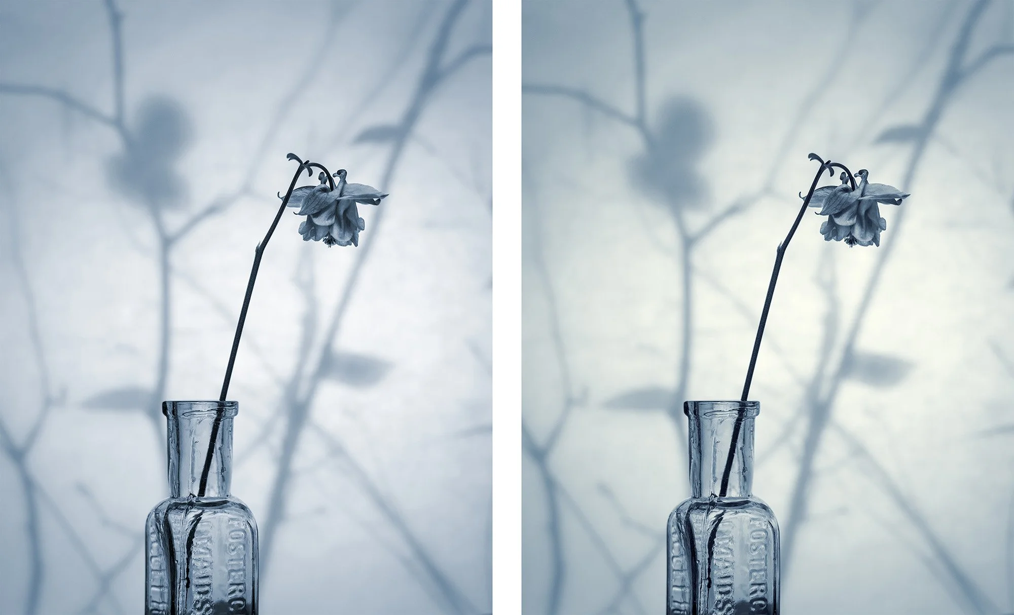
Aquilegia, Shadow Screen. A true monochrome image (a single colour of blue) on the left and a duochrome on the right.

‘Poppy & Daisy’
Now, if we add a second hue to our image then we would have a two colour photo or a duochrome! This was common practise when printing in a traditional darkroom using chemicals to introduce two tones and was referred to as split toning. With my digital work today, I like to split tone my images as it introduces a subtle (but not always subtle) contrast between the dark tones (shadows) and the light tones (highlights).
In my ‘Aquilegia, Shadow Screen’ duochrome image, the highlight areas have a yellow or warm tone compared to the overall colour which is a cool blue. You will also see the same effect in my ‘Poppy & Daisy’ photo. Although the overall tone is warm, there is still a subtle change of tone from the shadows to the highlights. The two images at the end of this post also clearly show the effect of a split tone.
So there you have it, I’m actually a duochrome photographer! But, just as it is the convention to refer to a greyscale image as a black and white photo, I’m still going to refer to my photography as monochrome because, well as Tevye the Milkman once said, or rather sang in Fiddler on the Roof, Tradition, Tradition, Tradition!
Cheers for now,
David.

Robin Haw, Applebury Hill, Grange-over-Sands. The split tone is very evident here with cool shadows and warm highlights.

Langdale Pikes over Windermere, The Lake District. The split tone is very evident here with cool shadows and warm highlights.